I recently asked some of my fellow CZTs to send me photos of tiles they had set aside for one reason or another and not finished . I thought it would be fun to finish the tiles and do a blog post to explain why I finished them the way I did. I was hoping to be able to give some insight into some of the roadblocks tanglers face and ways to get past them. I don’t know if I’ve achieved this but many thanks to Certified Zentangle Teachers Jessica Davies, Nancy Domnauer, Tasha Millhouse, and Anoeska Waardenburg for allowing me to give this idea a chance. It was challenging.
I’ll start with this tile sent to me by Tasha Millhouse.

I thought it was a great start with very nice Icanthis and Fengle that seems full of motion. I felt the Icanthis was getting a little lost and needed to fill out that corner so I added just a few more leaves. Then I added more rounding and some shading behind to make it stand out a little more. Since odd numbers of things seem to create a more pleasing composition I added two more Fengle, varying their size and flipping the two I added so they seem to be whirling in the opposite direction. This made it more interesting. I also like to do something unexpected so I continued the shading down the tile behind the Fengle but kept it mostly within the confines of the space created by the Fengle shapes. This also balanced the values of the tile. Finally it seemed to need a border to ground the tangles, but I only drew it around three sides and added the drippy lines to unify things. Here is the resulting tile.

Next up is this tile from Jessica Davies.

This is a nice variation of Aquafleur drawn around a heart shape. I think that the roadblock here is that the shape is smack in the middle of the tile. I decided to give the heart an inner aura and make it see-thru to give it less weight. Once it’s see-thru then you obviously see whats behind so I drew in the ribbons and extended them out to the edges of the tile. While I made the back of the ribbons white to emphasize the undulations it was still kind of hard to differentiate them. To emphasize each ribbon’s edges I added the white stitching. This helped a lot. I added a black pearl over the area where the ribbons emerge to try and push the focus more off center. Lastly I added some shading and the Printemps swath in the background. This accomplishes two things, 1) it emphasizes the see-through quality and 2) it is off center and pulls the focus from the middle of the tile. Here’s the final outcome.

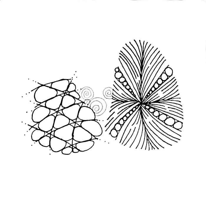
The next tile is from Anoeska Waardenburg.

This tile has a really good start. The composition so far has a lot of potential. It’s just one of those tiles where one can be unsure what to add next. When I get a tile like this I will usually set it aside and look back at it from time to time. Something eventually suggests itself. In this case several tangles that share some aspect with the existing tangles suggested themselves to me. First I added a little Mooka and a little more Flux. Then for a little different texture I added “peek-a-boo” Fluxecho. These tangles complimented the existing Flux. Then I added some Zinger which mirrors the shape of the existing Purk. Then I added the shaded aura border and a few enhancements like the black pearls, beads on the border and rounding on the Fluxecho. Don’t forget enhancements, they can really make a tile shine. Here is the final outcome.

Last was this tile sent by Nancy Domnauer

It took me a while to decide what to do with this tile. It is two nicely drawn tangles that are roughly the same size and shape in the middle of the tile with a few Printemps done in gray pen. I knew first off that I wanted to extend the gray Printemps to create a third shape. This goes back to the principle that an odd number of shapes is more interesting. About this time Margaret Bremner came out with her blog post about tangles that can be used for creating fantasy trees (you can read her post here). After reading her post I could see nothing but trees in this tile. I love Margaret’s Day/Night tiles so I decided to turn this into a Bremner-like fantasy tile. I have a Derwent Graphik Line Marker in a color called graphite that worked really well in this light to dark piece. I used it along with a little black pen on the Printemps tree and I really like the way it turned out. I also used it on the sun and plant detail. If Nancy had not used gray on those three Printemps I probably wouldn’t have used it on this tile. This all goes to show that you can’t know where your inspiration will come from, you just have to be open to it.

I hope I’ve managed to give you a few things to think about next time you ask yourself “How do I finish this tile?”
Blessings,
Lynn