Tangle Deck Update

All four 3.5 in. x 5.75 in. decks and
both 2 in. x 2 in. decks are back in stock!

large 3.5 in. x 5.75 in. decks

small 2 in. x 2 in. decks

New to the Tangle Deck Family
Tangle Deck Fragments #1

In their book, Zentangle® Primer Volume 1, Rick Roberts and Maria Thomas, the founders of Zentangle, introduced the concept of Reticula and Fragments. Reticula is another name for a grid or other structure that holds fragments. Fragments are small patterns that you draw within the individual spaces of a reticula (grid). The possibilities are exciting and endless but sometimes hard to visualize in your mind. I began to think of ways to demonstrate the power of fragments.

Note: The following information is excerpted from the companion E-book, ” How To Use Tangle Deck Fragment Cards to Visualize Patterns and Inspire Creativity,” which is included with each deck as a digital download.

Tangle Deck Fragment Cards – The Beginning

To fully understand the possibilities of using fragments, I wanted to have a set of fragment cards that I could play with by rotating and repositioning to help me visualize how fragments relate to each other and, in the process, create a multitude of meta-patterns. Thus, the idea for the Fragment Cards was born. But there are so many different fragment possibilities; where does one start? I have purposely not used the fragments from the Zentangle Primer Volume 1 to demonstrate that you can create and discover fragments on your own. However, I highly recommend the book as a valuable resource.


I decided to take it “one stroke at a time” and start with a simple C-curve that extends diagonally from corner to corner, a quarter circle. All the cards in the first set of Tangle Deck Fragments (Set #1) are based on this simple C-curve.

Different but related fragments are created by adding additional C-curves that still follow the rule of extending diagonally from corner to corner.

Using the Hollibaugh drawing behind technique creates an even wider variety of fragments. Where two C-curves cross, one of the lines stops and disappears as if continuing behind the shape created by the other line, creating an illusion of overlap.

Out of all the numerous possibilities I came up with, I chose ten different fragments to include in the first Tangle Deck Fragments deck. Each of the selected ten fragments has 12 cards, providing 120 cards in each deck. These are not all the possible variations using C-curves, but they are a good variety and enough to create hundreds, if not thousands, of meta-patterns.

The Flip Side

The back of each card has the same fragment as the front, with the addition of a grayscale value in each shape. I used Black, White, and a 50% shade of Gray. When placed in a grid, these cards demonstrate how adding value (or color) can affect the resulting composition’s look. Your eye combines adjacent shapes of the same value into one shape that crosses grid boundaries and redefines meta-patterns. 

So, how do you use Fragment Cards?

  • Play with them as a creativity exercise 
  • Combine fragments to discover different shapes and meta-patterns
  • Create strings and add tangles
  • Create compositions defined by values (or colors) and add tangles

Tangle Deck Fragment Cards #1 has a companion E-book with information on how to use fragments, four exercises to get you going,  and inspiring examples.

I hope you try them and let me know what you think.

Blessings,

Lynn : )


My Tangled Floor Cloth Project

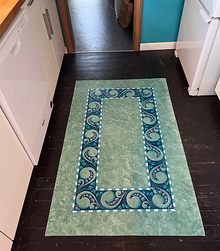
Recently I posted on Facebook about my Tangled Floor Cloth Project, and many people were interested in the materials I used and the process of making the floor cloth. The story is a little long for a Facebook post, so I’ve written a blog about it.

I have been intrigued by floor cloths for some time. I spend a week each summer at an Art Camp where you bring your own projects, and each year I try to bring something I have never done before. This confluence of interests and events seemed the perfect opportunity to tackle creating a floor cloth. I currently don’t have the space to work on a project this size at home, so taking advantage of the space provided at camp seemed like a great idea.

Materials:

The material was a bit of an experiment. I got a 5′ x’ 5′ remnant at a local non-profit textile recycling shop called the Ragfinery for $5. It was not the usual numbered cotton duck used for floor cloths but was, I believe, a material used either for upholstery or awnings. It was a heavier synthetic material with a vinyl coating on one side, but it still had a woven texture and lay flat on the floor, so I tried it.

The cloth I bought was wine-red, but I put a coat of white primer on it, so the color didn’t matter. I bought some recycled latex paint at the local Habitat for Humanity store for the base color of the cloth (green). I planned to put this cloth in my kitchen when it was finished, and I had a turquoise paint sample that matched the kitchen walls, so I added that to my painting supplies. I dug out various acrylic paints and paint pens I already had for additional accent colors. I also selected several brushes from what I already had on hand. I experimented with different ways to add shading details, and in the end, I used Faber-Castell Pitt pastel pencils and Pan Pastels (more about that later). I bought a quart of triple thick matte finish Polyurethane to seal and protect the cloth when I was done painting it.

Process:

I cut the cloth from 5′ x 5′ down to 3′ x 5′. The 2′ x 5′ off-cut gave me some cloth to experiment with when deciding on colors and technique.

After painting the cloth with a white primer that promised to stick to practically anything (remember it was already coated with vinyl), I taped off the border area and created the background. It turned out that the color of the green paint I bought wasn’t exactly what I wanted, so I added some of the acrylic paint I had to create a color I liked. I wanted a simple and quick technique for the background because I wanted to spend most of my time on the border. What I came up with was to paint a section with green paint, then go over it with a smaller brush using a swirling movement. This was quick and gave a mottled swirly effect that was interesting but subtle enough to let the border graphics take center stage.

I had a vague idea of the design for the border, and I knew I wanted to use an alternating-color Knightsbridge-ish pattern somewhere. I decided to add a border that alternated white and turquoise in a thin stripe around the outside and inside of the main border area. I was getting some leakage under the painter’s tape, and it was at this point I remembered the trick of laying down the tape and then painting over the edges with a clear acrylic medium to seal the edges. Worked like a charm. Once this narrow border was completed, I used a brush to fill in the main border area with green.

Now came the tricky part, laying out the border elements. I measured the length and width of the border and calculated a measurement for the large Mooka I thought would work as a repeat element around the border. Never having tangled this large before, I was a little unsure of myself, so I cut out a paper template and did a test layout to see if it would work, and it did! I then transferred the template onto some stencil material. I used this stencil to draw the large Mookas around the border. Once these were placed, I filled in the remaining elements freehand. All this was done using a pencil.

To define the border elements, I painted around them with a darker color. I created this color by mixing dark blueish-green and purple acrylic paints. This resulted in a dark blueish color.


Once the dark background of the border was complete, I felt like the design needed more of the turquoise color to tie the cloth to the turquoise wall of the kitchen, so I painted all of the Damsel Leaf turquoise.

Now came the shading of elements. I have to admit I am not an experienced painter. I tried several techniques for adding shading but didn’t like the results. I often use pastel pencils to add colored shading to my Zentangle tiles, and I wanted something similar to that process. I decided to experiment with my Pan Pastels. After all, they call them pastel PAINTINGS, don’t they? I did some tests applying the Pan Pastels with the sponge applicators, then blended them with some large tortillons. This worked incredibly well, as the pastels stained the underlying paint. I was even able to make some adjustments with an eraser. This worked for everything but the white highlight. I ended up using a white paint pen along the edges and spraying the white highlights with acrylic sealer. I knew the pastels would be fine when I added the polyurethane because I wiped the cloth with a wet sponge, and the pastel colors didn’t diminish at all. This was an experiment that was very successful. I also wanted to mention that I used the same blue-ish green and purple colors for the shading that I used to mix the dark blue background. This resulted in a very harmonious color palette.

I should mention the books I read and the videos I watched all recommended that you hem the cloth before any painting is done. I did not have the opportunity to do this before I left for art camp, so I waited until the cloth was completely painted, and I had no problems doing it this way. I used my early 1990s-era Bernina (inherited from my Mom) with a leather needle. I finished the cloth with three coats of triple-thick outdoor-rated polyurethane.

I am so happy with the final outcome, even though I deviated from some of the standard procedures recommended for floor cloths. My first attempt at making a floor cloth turned out beautifully; it lays flat on the floor, is flexible, and I love seeing it when I walk into my kitchen. Many have said they would find it hard to walk on. My response to that is, do you feel the same way about walking on a specially designed area rug? Rugs are meant to be walked on, and so are floor cloths.

I hope you enjoyed this telling of my floor cloth journey and are inspired to try something similar. I think my next “big” project will be a table runner.

As always,

Blessings,

Lynn