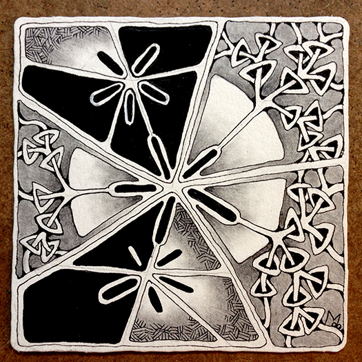
This week’s (Sept 30 – Oct 6) Square One focus tangle is Florez introduced by Andrea Shuman, aka Cookie. This is a tangle I have not used before but is a close relative of N’Zeppel one of the tangles introduced by Zentangle HQ.
If you follow my blog you will know that I usually start out the Square One focus by just playing around with the tangle to get to know it better, especially if it’s one I’ve not drawn before. This has been a very hectic week so I thought I’d pick up a tile and just draw without intending it to be a Square One tile. Before I realized it I had drawn a Florez shape string so decided to go with it. Unfortunately I was swept up in the creation of this tile and did not take any work-in-progress pictures, but I can share a lot about this tile anyway.

First off I should reveal that it started in a completely different direction than what you see as the finished tile. I started drawing patterns in the shapes that are now black, then was inspired to draw the sections that contain Rixty. I loved where that took me but it didn’t really go with the sections I started with. Those sections had to go, so that is how they came to be black (my own take on the Bronx Cheer). This literally set the tone for the rest of the tile. From that point on, drawing and shading decisions were made in order to balance out these black spaces.
The second thing I wanted to point out was the use of Convergent Shading in this tile. I introduced this concept in Tangle Deck 2 but have not addressed it here in my blog. It is used in the sections containing Rixty. In convergent shading two adjacent shapes are shaded from dark to light in opposite directions. Here is an example using stripes so it is easier to see.

In this tile the area around Rixty is shaded dark to light toward the center while the pie shapes are shaded dark to light from the center out. Here is a detail showing what I mean. This helps to define edges in an interesting way.

The third thing I wanted to share about this tile is the way the black shapes float on top. Usually darker shapes recede into the background. I did not do this intentionally, it just happened as a result of the way Rixty is drawn seemingly on top of the pie shapes pushing them to the back. Further supporting this illusion you can imagine that those pie shapes continue behind the two black sections to form a circle. As one person commented “It looks like the moon is hiding in the back!” Take another look at the tile and see if you can see what I mean.

This tile had secrets to reveal and I admit I was an accomplice.
As always, If you see something in this post you’d like to try in your own work, please do.
If you are on FaceBook and you’d like to try the Square One focus sometime, or just follow the page for inspiration you will find it here.
Blessings,
Lynn
