Groovy – Square One Focus

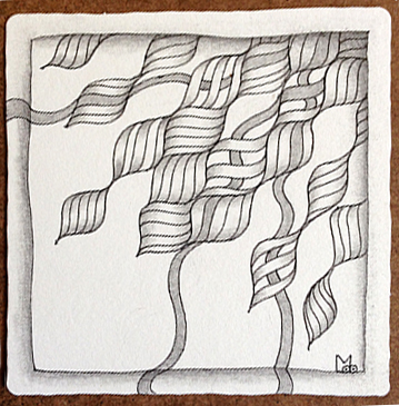
This week’s Square One: Purely Zentangle focus tangle is Groovy by Eden Hunt. Step Outs for this tangle can be found here.

I have a very busy summer ahead so I don’t know if I’ll be able to keep up with the weekly posts for the Square One focus. I’m already behind and I decided I wouldn’t try and catch up. But first off here are the two tiles I did for last week’s focus: Rundl by Ela Rieger.

In the first tile I added Diva Dance to Rundle and did the background using pencil.

Rundl-01

In the second tile I used rounding on the Rundl.

Rundl-02

Now to this weeks focus tangle. Groovy, uses a wavy grid, also known as an Ogee grid. It looks like this. (Note: I mentioned this grid in my last post too.)

ogee

To warm up for this week’s tile I decided to do a “sampler” tile with several tangles that use this grid. It turned into a kind of Family Portrait. Tangles used are top & bottom – Bask-it by Anna Houston, left to right – African Artist by Tina Hunziker, Scrumble by Jane Monk, and Groovy by Eden Hunt.

Groovy Family Portrait

After this fun warm up exercise I moved on to a mono tangle of Groovy. I started with the wavy grid but as you can see it did not want to stay together and instead pulled apart a bit at the edges.

Groovy-01-150ppi

Next came the diagonal lines that alternate back and forth. They didn’t want to cooperate either and one space got left blank.

Groovy-02-150ppi

Then anarchy ruled and some of the ribbons got loose and some of the shapes turned see through.

Groovy-03-150ppi

In the end I let Groovy have it’s way and I like what it did. What do you think?

Groovy-04-150ppi

As usual if you see anything in this post that you would like to try in your own work please feel free to do so.

Blessings,

Lynn

C-Wing – Square One Focus

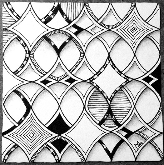
This past week the Square One focus tangle was C-wing by Staub Korn.  It is one I had never tried before so I practiced it a bit in my sketchbook in order to get to know it a little better. I noticed a couple of interesting things about this pattern. First, there is an Ogee grid hidden in the pattern (I’ve gone over it in red in the photo below) and Second, it can be broken down into a Fragment which when mirrored and rotated forms the tangle ( I’ve also indicated the fragment in red).

C-wingSketchIdeas-150ppi

If you are unfamiliar with Fragments, they are a concept that Rick and Maria have introduced in their recent book Zentangle Primer Vol. 1. Fragments are elements that when placed in a grid create a pattern. Note: R&M refer to the grids used with fragments as Reticula. Different patterns can be created by repeating, rotating or mirroring a fragment. But more about that in a later post.

For this week’s tile I started with a dot grid since I didn’t want the lines from a lined grid to show. I chose to use a variation of the tangle that offset the overlapping shapes in alternating rows.

cwing-1-150ppi

I did the main outline with a .05 Apprentice pen. Then I drew an inner aura in each shape with a .01 micron. Some shapes I made see-thru so the shapes behind could be seen. Then I added tone and texture through line and fill.

cwing-2-150ppi

The shading enhanced the effect of the solid and see-thru, the foreground and background. Here’s the final tile.

cwing-3-150 ppi

What I like about this tile is that the tangle is very regular but the fill is unexpected.

As always if you see something in this post that you’d like to try in your own work, please feel free to do so.

Blessings,

Lynn
Printemps – Square One focus tangle

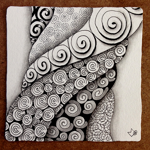
This weeks Square One focus tangle is Printemps. This is one of the tangles I use all the time so I did not feel the need to explore this tangle in my sketchbook this week.

I have been wanting to do a tile using Margaret Bremners “Rope String” idea though and thought this might be a good time to try that.

I started off with a Rope string and began filling it with different variations of Printemps.

Printemps-01-150ppi

Then I added some black background, line weighting, and sparkles to some of the variations. This added a little more contrast to the tile.

Printemps-02-150ppi

Finally I added the shading to finish the tile. I wanted the section with the large line weighted spirals to be in the forefront and then each section to be on top of the next moving toward the edges of the tile. Each section was shaded only along one edge to help create this illusion.

Printemps-03-150ppi

I like the way the Rope string provided discrete sections for the Printemps variations and also tied them all together (no pun intended or maybe it was).

As always if you see anything in this post that you would like to try in your own work please feel free to do so.

Blessings,

Lynn