TransluZENce

I’ve been wanting to share the technique of TransluZENce and this week’s Square One Purely Zentangle focus, Membranart by Tomas Padros (step-outs found here), has given me the chance to do so. TransluZENce is a cousin to TranZENding, a technique recently introduced in a Kitchen Table Tangles (KTT) video by Rick and Maria on the Zentangle Mosaic app. While TranZENding is based on drawing one tangle on top of another and then using white to highlight and graphite to shade, TransluZENce is based on drawing behind and then using graphite to make it look like you are viewing the background through a translucent media like tissue paper or frosted glass.

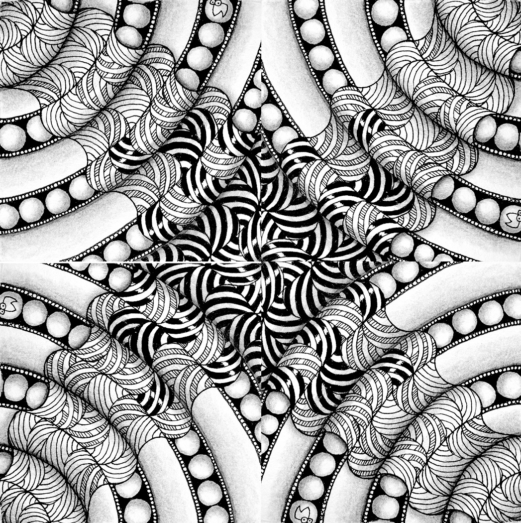
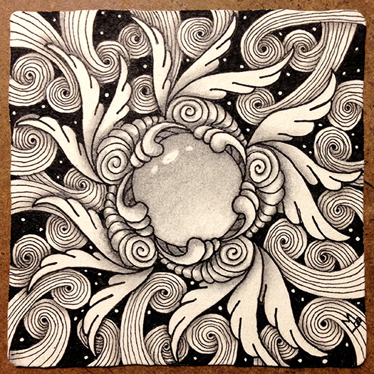
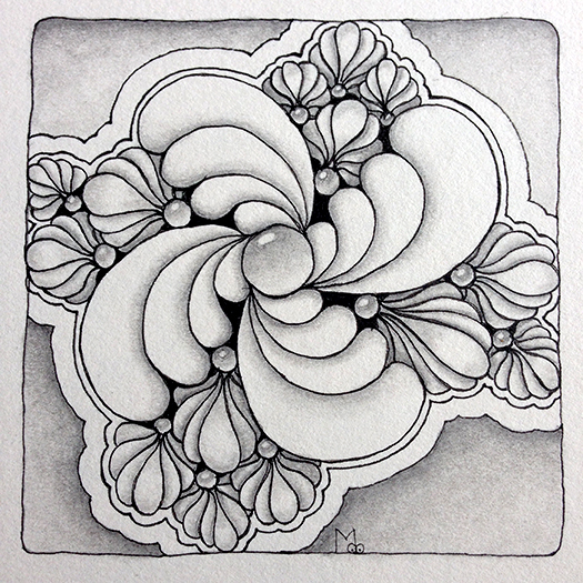
I decided to create an example using Membranart and Hollibaugh as everyone is familiar with the draw behind aspect of Hollibaugh. Instead of Membranart appearing opaque it appears translucent, giving a glimps of what lays behind.

Here is how this illusion is created…

With your pen, start Membranart as normal.

Again with your pen and using the principle of drawing behind add Hollibaugh in the background.

Using a pencil on top of Membranart, connect up the lines of Hollibaugh that would normally be hidden.

Using your pen, fill black in the areas between the Hollibaugh lines in the background.

NOTE: this technique will be more effective if you use high contrast tangles in the background.

Now, to make Membranart look translucent, use your pencil to lightly and evenly add graphite to the spaces between Hollibaugh on top of Membranart. Smooth out the graphite using a tortillon or paper stump.

Finish the tile with shading to create 3D and layering effects.

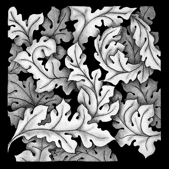
Here is another example using Membranart (makes me think of something spilled on the kitchen floor.

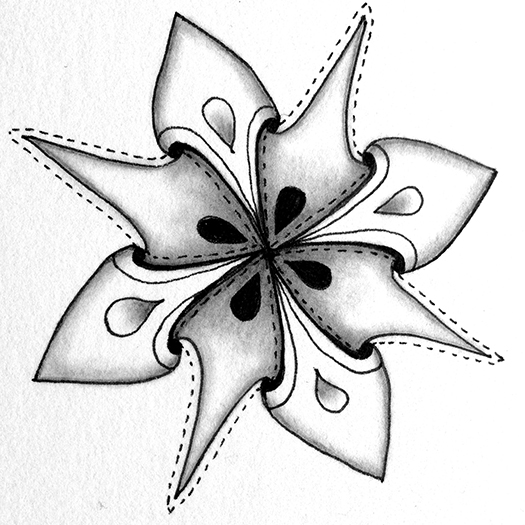
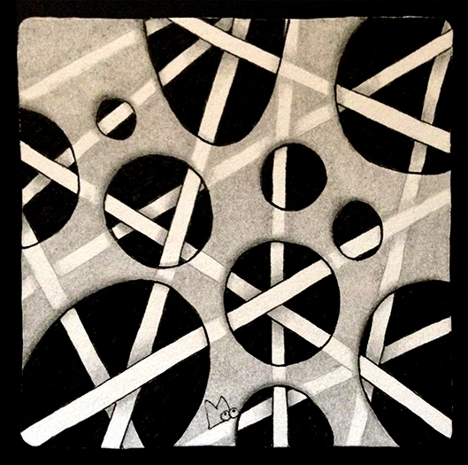
And another example I did using Puffin and Showgirl back in June, 2017.

As is usual, if you would like to try anything in this post in your own work please feel free to do so. If you post your work, please use the hashtags #transluzence or #transluzent where they are allowed and let people know about this post. Many thanks.


Blessings,

Lynn


haKrall and Friends – Building Bridges

I recently created this tile for the Square One Purely Zentangle Facebook page. The focus tangle was haKrall (deconstructed by Holly Atwater, stepouts here) and I paired it with Stoic (Zentangle®, AKA Twile, stepouts here) and B’Twined (deconstructed by Pegi Schargel, stepouts here). This tile was a real meditation for me and it turned out to be a sort of square zendala with a maze-like feel to it.

I had several people ask if I had work-in-progress photos of this tile so they could see how the tile developed. I have to admit, I was so absorbed in the zen of this tile that I did not even think to stop and take photos as it developed. However, thanks to some digital magic I have created some graphics that will help to explain the process.

This tile was started with a simple pencil string grid, 6 squares by 6 squares, recreated here in red.

This layout can be broken down into three rings (for lack of a better word, square rings? oh well) starting from the outside perimeter and working toward the center. One for each of the three tangles I’d chosen.

Stoic on the outside ring

haKrall on the middle ring

and B’Twined in the center

As you can see from these graphics each tangle is simply drawn on one of these three concentric rings. The magic happens for this tile because there is a relationship between these tangles. Both Stoic and haKrall have the center square with arms radiating around in slightly different ways. All three are really fragments that when put together on a grid have an over and under woven appearance.

These tangles work so well together on this tile because connections or as I like to call them BRIDGES are created between the tangles. To create the bridges I was mindful of two things as I was drawing, proportion and orientation.

The parts of each tangle that connect with the tangle in the adjacent sections need to be roughly the same dimension.

The tangles in each section needed to be oriented correctly to align with the tangles in the other sections.

This is not as difficult as it may look or sound. You just start with one tangle. I started with stoic around the outside. When you start the next tangle in the next section it will be obvious how to orient it to match up with the adjacent section and the proportion it needs to be so that a bridge is created. Visualize extending lines from the first tangle into the next tangle. Just work slowly and mindfully.

The point here is that nothing special was done to these tangles to get them to flow together, it is simply a matter of being mindful of their similarities and how they can form connections. In fact there’s a good chance you have already done this on some of your own tiles.

I also feel this is a good life lesson too. We would all be better off if we were more mindful of our similarities and used them to forge connections. Something to think about anyway.

As always if there is anything in this post that you would like to try in your own work please feel free to do so.

Blessings,

Lynn


How do I finish this tile?

I recently asked some of my fellow CZTs to send me photos of tiles they had set aside for one reason or another and not finished . I thought it would be fun to finish the tiles and do a blog post to explain why I finished them the way I did. I was hoping to be able to give some insight into some of the roadblocks tanglers face and ways to get past them. I don’t know if I’ve achieved this but many thanks to Certified Zentangle Teachers Jessica Davies, Nancy Domnauer, Tasha Millhouse, and Anoeska Waardenburg for allowing me to give this idea a chance. It was challenging.

I’ll start with this tile sent to me by Tasha Millhouse.

I thought it was a great start with very nice Icanthis and Fengle that seems full of motion. I felt the Icanthis was getting a little lost and needed to fill out that corner so I added just a few more leaves. Then I added more rounding and some shading behind to make it stand out a little more. Since odd numbers of things seem to create a more pleasing composition I added two more Fengle, varying their size and flipping the two I added so they seem to be whirling in the opposite direction. This made it more interesting. I also like to do something unexpected so I continued the shading down the tile behind the Fengle but kept it mostly within the confines of the space created by the Fengle shapes. This also balanced the values of the tile. Finally it seemed to need a border to ground the tangles, but I only drew it around three sides and added the drippy lines to unify things. Here is the resulting tile.


Next up is this tile from Jessica Davies.

This is a nice variation of Aquafleur drawn around a heart shape. I think that the roadblock here is that the shape is smack in the middle of the tile. I decided to give the heart an inner aura and make it see-thru to give it  less weight. Once it’s see-thru then you obviously see whats behind so I drew in the ribbons and extended them out to the edges of the tile. While I made the back of the ribbons white to emphasize the undulations it was still kind of hard to differentiate them. To emphasize each ribbon’s edges I added the white stitching. This helped a lot. I added  a black pearl over the area where the ribbons emerge to try and push the focus more off center. Lastly I added some shading and the Printemps swath in the background. This accomplishes two things, 1) it emphasizes the see-through quality and 2) it is off center and pulls the focus from the middle of the tile. Here’s the final outcome.


The next tile is from Anoeska Waardenburg.


This tile has a really good start. The composition so far has a lot of potential. It’s just one of those tiles where one can be unsure what to add next. When I get a tile like this I will usually set it aside and look back at it from time to time. Something eventually suggests itself. In this case several tangles that share some aspect with the existing tangles suggested themselves to me. First I added a little Mooka and a little more Flux. Then for a little different texture I added “peek-a-boo” Fluxecho. These tangles complimented the existing Flux. Then I added some Zinger which mirrors the shape of the existing Purk. Then I added the shaded aura border and a few enhancements like the black pearls, beads on the border and rounding on the Fluxecho. Don’t forget enhancements, they can really make a tile shine. Here is the final outcome.


Last was this tile sent by Nancy Domnauer

It took me a while to decide what to do with this tile. It is two nicely drawn tangles that are roughly the same size and shape in the middle of the tile with a few Printemps done in gray pen. I knew first off that I wanted to extend the gray Printemps to create a third shape. This goes back to the principle that an odd number of shapes is more interesting. About this time Margaret Bremner came out with her blog post about tangles that can be used for creating fantasy trees (you can read her post here). After reading her post I could see nothing but trees in this tile. I love Margaret’s Day/Night tiles so I decided to turn this into a Bremner-like fantasy tile. I have a Derwent Graphik Line Marker in a color called graphite that worked really well in this light to dark piece. I used it along with a little black pen on the Printemps tree and I really like the way it turned out. I also used it on the sun and plant detail. If Nancy had not used gray on those three Printemps I probably wouldn’t have used it on this tile. This all goes to show that you can’t know where your inspiration will come from, you just have to be open to it.

I hope I’ve managed to give you a few things to think about next time you ask yourself “How do I finish this tile?”

Blessings,

Lynn

Showgirl and a new Tangle – Fluxecho

It’s been a while since I’ve posted to this blog. First I was getting ready to teach a class at Tangle U (a continuing education conference for CZTs) and then on the way back from that I caught that horrible cold that was going around and was out of it for around 6 weeks. Since then I’ve been trying to get caught up on things. I’m glad to be able to post again.

This week I’m getting back to posting my Square One: Purely Zentangle focus tile. This week’s focus is Showgirl by Vicki Bassett. Step-outs for this tangle can be found here.

I actually drew three tiles for this focus, each one with something to share with you. In the first tile I used Showgirl along with a Tangle called Fluxecho that I introduced at Tangle U.

Fluxecho got it’s name from the fact that it looks a bit like Flux with additional lines that echo the original shape. It starts out with an orb and two opposing “S” curves so that it looks like an exclamation point! It grows very organically and tucks together nicely to form a grouping. Here are the step-outs and some variations.

The next tile I did I decided to make some of Showgirl’s “feathers” have transparent centers by drawing an inner aura so the feather behind showed through. This came out looking a lot like Lupe by CZT Christina Vandervlist. While the end result looks very similar to Lupe the process for drawing is slightly different. Step Outs for Lupe can be found here if you’d like to compare the two methods.

Here’s how I created this look. First start out with a completed Showgirl figure.

Then Draw an inner aura around the central “feather”. This is the top layer.

Then, draw an inner aura around the “feather” that is the next layer behind,
making sure to continue it’s lines behind the first layer so that it shows through.


Continue this process of drawing inner auras, continuing the lines of each petal
behind the lines of the “feather” that is on top of it.

The final result will look like this.

Finally, I wanted to draw a tile using Showgirl and last weeks Square One focus tangle, Puffin.

It turned out looking like Puffin had been appliqued on top of Showgirl out of some translucent material so that Showgirl partly showed through. To achieve this effect I just continued the lines of showgirl and filled them in with pencil, then continued the lines in pen when they emerged from behind Puffin. The perf lines around the edges of Puffin added to the applique effect.

I didn’t start out to draw three tiles that demonstrated different things but I like them all so I’m glad I could share them with you. You just never know where Zentangle is going to take you. As always if you see something in this post that you would like to try in your own work, please feel free to do so.

Blessings,

Lynn

Man-O-Man to Celtic Knots

There has been a lot of interest recently in drawing Celtic Knots and there are lots of techniques for drawing them. In my opinion, most do not really follow the Zentangle® drawing method, they involve too many steps or are just too complicated.

Here is a simple three step method I’ve come up with that originated with the tangle Man-O-Man. If you are unfamiliar with this tangle here is the card from my Tangle Deck that shows the step-outs:

As you can see this tangle starts with a square and then squares are drawn next to each of it’s sides to form a cross. Note there is an equal space left between the squares. Triangles are added to fill in the angles formed by the cross, again leaving equal space between the shapes. You can continue adding shapes out as far as you want, building on the previous ones and leaving equal space between them.

Let’s take this one step further. Start by drawing steps one and two in the man-o-man step-outs.

Then draw an aura around the perimeter of these shapes that is offset from them the same distance as the space between them. What happens when you do this is that you can begin to see the squares and triangles as spaces and the space between them as a kind of lattice above them.

I call this Lace Lattice because it reminds me of the holes and strings that make up a piece of lace. Here I’ve added some Beadline behind the Lace Lattice to make it more visible.

With the right configuration of hole shapes, aura and one final step, you can easily and quickly turn the resulting Lace Lattice into a Celtic Knot. Let’s start out the same way we would with the Man-O-Man tangle, with five squares in the form of a cross.

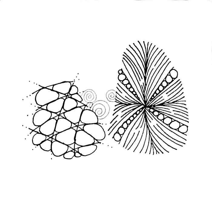
Then add rounded triangle and semi circle shapes as shown.

Turn this into a Lace Lattice by drawing an aura around the outer edges.

To turn this into a Celtic Knot, draw lines to connect the Lattice, alternating between
horizontal and vertical to create the over and under of the knot.

Ta Da! a Celtic Knot

I’ve spruced it up a little with additional auras and shading.

Here are a few other simple configurations.

And something more free-form starting with a loopy string.

Final drawing with perf line, aura, rounding and shading.

The possibilities seem endless with this technique and you can go as simple or complex as you want. The trick is to keep your spacing between the shapes as even as possible so that they will align when you connect them, but even then it doesn’t have to be perfect. I should note here that just drawing a bunch of shapes next to each other won’t work every time to form a knot. Play around with the technique and you will soon see what will work and what won’t. Finally, here is the drawing I did for the ShamWayRockBop challenge from Rick and Maria using this technique for the border.

I hope you give this method a try and I look forward to seeing all the Celtic knot variations you come up with.

Blessings,

Lynn

Reticula and Fragments

Reticula and Fragments were introduced by Rick Roberts and Maria Thomas (founders of Zentangle) in their book Zentangle Primer Volume 1. Reticula are simply frameworks in which to place pattern fragments. Fragments are little chunks of patterns that when rotated or mirrored and placed together in a reticulum (framework) create a larger pattern. Think ceramic tiles. Each tile is a unit and when put together, the elements of each tile work together to create a larger pattern. Depending on the tile’s pattern and how the tiles are put together a number of different variations are possible.

Recently, as I was looking at the photos on my phone I came across several photos of a tile rotated in different positions.

This is the tile

I saw that the tile itself could be considered a fragment of a larger design and immediately went to my computer and started rotating and flipping and combining. The results were very interesting and I wanted to share them here.

Of course then I wanted to experiment with other tiles. Here are a few of the designs I came up with. Note: none of the tiles were drawn with the idea that they would be rotated, mirrored and combined, so it was interesting to see how things lined up.

Hope you enjoy the results of my experimenting, I know I did. Reticula and Fragments are really quite fun. You should try them yourself although maybe on a smaller, simpler scale to start with.

It also made me realize that we are all just part of a larger pattern.

Blessings,

Lynn

Icanthis – Square One Focus

January 4, 2017

The Square One (TM) focus tangle for this week is one that was released by Zentangle HQ in December 2016, called Icanthis. The stepouts can be found here.

Icanthis was inspired by the Acanthus Leaf motif found in art and architecture from the time of the Greeks in the 5th century forward. My tile was inspired by the Acanthus wall paper designed by William Morris.

It is basically the Icanthis tangle drawn in layers in a Hollibaugh manner. That is, start by drawing one layer and then add additional layers by drawing behind.

Since this is a black and white tile, I began to differentiate the different layers by adding shading where they overlap.

before blending the pencil shading

after blending the pencil shading

I then added in the black background color which further defined the shapes.

I then refined the shading to add some additional detail.

Finally I added a little more shading to the leaves further back to give them more depth  and enhance the leaves in the front.

I like the way this tile turned out. It reminded me how adding detail in layers can really add depth and emphasis to a drawing. As always if you see something in this blog that you would like to try in your own work, please feel free to do so.

Blessings,

Lynn

Stella – Square One Focus

This week’s Square One (TM) Purely Zentangle focus tangle is Stella by Jana Pharmer (formerly Jana Roberts). Stepouts for Stella can be found here.

I started out this week drawing Stella in my sketchbook. Here is my first attempt. Stella is a fairly straight forward tangle that uses the elemental C stroke. It’s the same shape around the figure but every other one alternates direction.

As I drew this first version I began to see that one could expand it out through several rings like this:

Here, I’ve indicated the Stella in red so you can see it better. the Stella shape changes orientation as it’s drawn on each ring, sometimes up, sometimes down, sometimes on it’s side. The key is to align it to the shapes in the previous ring.

I then added some enhancements (tanglenhancers).

I finally added shading. I intended to do the background all black but got half way through and it seemed like I should stop.

It didn’t seem quite finished though so I added a little more shading around the edge on the light side of the tile. That provided the finishing touch for me.

Next I thought about trying Stella as a six armed figure instead of eight. When I tried it I realized that by making it a six armed figure I could turn it into a tesselated Reticulum (that’s a fancy name for a framework). Each shape was exactly the same so I could fit them together like a puzzle. The next pictures show the six armed figure I started with in red and then the finished tile.

Rick and Maria introduced “Reticula and Fragments” in their Zentangle Primer – Volume 1. Check here for more information about the book.

This weeks tangle really stimulated my tangler’s mind. I hope my examples stimulated yours.

As always if you see something in this post you’d like to try in your own work please feel free to do so.

Blessings,

Lynn

Introducing the first TangleLace kit: WinterLace

In November I was blessed to be asked to teach several classes to a wonderful group of Certified Zentangle Teachers at a retreat in Maine. Two of the classes were a series. In the first class I taught the Lace and Convergent Shading techniques. The second class was a project that was inspired by the tangled drawings I had seen posted that had been done on paper doillies. I had paper laser cut with a simplified lace design and used the Lace and Comvergent Shading techniques to create the following winter inspired design. I call it WinterLace.

The project uses metalic gold and clear stardust (sparkles) Gelly Roll pens which are difficult to photograph. However, this photo is a pretty good example of the finished product.

These two classes were very well received and as a result, in partnership with Acadia Laser Creations, I decided to make it into a kit.

The kit contains instructions for both classes (a 2-fer) and all the materials and supplies you need to create your own WinterLace project.

The Kit materials include a laser-cut pattern on dark blue paper, a light blue background sheet, a white mat with foam core backing and protective sleeve, 3 gel pens, 2 colored pencils, a royal blue Micron and 2 tortillons.

“But wait … there’s more!”

My fellow CZT, Jenny Perruzzi, suggested I should include a stencil that would allow you to draw the same lace shapes that are laser-cut in the kit. I rarely encourage the use of stencils in Zentagle as I feel they can too easily become a crutch and support that inner critic that says “I can’t draw” (therefore I need a stencil). Well she cut one for me anyway and I had a lot of fun with it. I realized that this project is actually considered Zentangle Inspired Art (ZIA) so playing is OK, and the stencil actually reinforces some of the concepts taught in the Lace technique.

So included in the kit is a 3-in-1 stencil to play with and create endless designs. There are 3 sizes on the stencil: Small (Zendala size), Medium (same size as project piece – a zendala tile fits in the center) and Large (Opus size). The overall stencil measures 10.5″x10.5″. See photo below.

Here are some sample pieces I created using the stencil.

This piece was drawn on a 10.5 x 10.5 Opus tile and
uses the large size stencil.

This piece was drawn on a 4-5/8″ Zendala size tile and
uses the small size stencil

This piece was drawn on an 8″ square and
uses the medium size stencil.

This example also uses the medium size stencil but
shows the use of a separate Zendala placed in the center.

So you can see, once you learn the techniques there is no end to what you can create.

Here’s what other Tanglers are saying about the kit…

“Lynn takes intimidation out of the drawing equation. What might appear to be a complex drawing becomes a simple step-by-step process with Lynn’s clear and easy instruction.”

“Lynn’s project is awesome! I was overwhelmed by the artistry of the finished product.”

“Lynn’s easy step-by-step instructions will put you right at ease and have you feeling like a pro in no time! Not to mention feeling like a creative genius with the beautiful end product you will create with this amazing kit!”

“Lynn’s unique perspective on the world translates into easy to follow design techniques so that anyone can create beautiful art work.”

The WinterLace kits are now available on Etsy for an introductory price of $65.00 through the Winter Solstice, Dec. 21.
https://www.etsy.com/…/498115…/the-tanglelace-winterlace-kit

I’m very excited to reach a larger audience with the classes contained in this kit.

Blessings,

Lynn

Moowa – Square One Focus

This week’s Square One focus Tangle is Moowa by CZT, Anya Ipsen. Step-outs can be found here.

While my tile this week does use Moowa (it is the tangle in the middle) this post is more about finishing a tile than about the tangle itself.

As you can see from the first photo I took, sometimes the tangle only drawing is just too busy. It really needs contrast and shading to differentiate the different tangles. From the center out I’ve used Moowa, Joki, Drawing, and Sandswirl.

moowa-1-150ppi

You can see how just adding the black background is starting to give shape to things.

moowa-2-150ppi

On this tile I worked from the background forward. Adding extra lines to the sand swirl darkened its tone a little and pushed it behind Drawings. I’ve also gone over Moowa and Drawings with a thicker pen.

moowa-3-150ppi

Adding shading further defines the tangles.

moowa-4-150ppi

And finally, I shaded the central section.

moowa-final-150ppi

I love how this came out. It reminds me of Madeline L’Engle’s book “A Wrinkle in Time”. The middle is like a window into another world.

As always, If you see anything in this post that you’d like to try in your own work, please feel free to do so.

Blessings,

Lynn