January 4, 2017
The Square One (TM) focus tangle for this week is one that was released by Zentangle HQ in December 2016, called Icanthis. The stepouts can be found here.
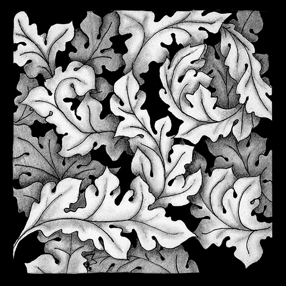
Icanthis was inspired by the Acanthus Leaf motif found in art and architecture from the time of the Greeks in the 5th century forward. My tile was inspired by the Acanthus wall paper designed by William Morris.
It is basically the Icanthis tangle drawn in layers in a Hollibaugh manner. That is, start by drawing one layer and then add additional layers by drawing behind.


Since this is a black and white tile, I began to differentiate the different layers by adding shading where they overlap.

before blending the pencil shading

after blending the pencil shading
I then added in the black background color which further defined the shapes.

I then refined the shading to add some additional detail.

Finally I added a little more shading to the leaves further back to give them more depth and enhance the leaves in the front.

I like the way this tile turned out. It reminded me how adding detail in layers can really add depth and emphasis to a drawing. As always if you see something in this blog that you would like to try in your own work, please feel free to do so.
Blessings,
Lynn

I love this tile so much Lynn – I have been really struggling to like this tangle but I will definitely have a play with it now. Thank you for sharing your creative process – always very interesting!
Lynn, this is so beautiful and really looks like a William Morris piece! I love seeing your process and thought to myself it would be easy to get lost before the shading, which is beautiful too. You really achieved great dimension with the shading and black background.
This is simply stunning!!! I appreciate the progression pictures as it really clarifies the process you went through. I would have gotten lost in my own drawing, not remembering which was which somewhere between picture two and three! Amazing and beautiful!
Michele, Thanks for your kind words. I think that next time I try a drawing like this I would be tempted to add a little shading as I’m drawing the layers just to keep track of them as I draw. It did take a lot of concentration.
What a great example of overlap and shading. Thanks so much for publishing the progression! Beautiful tile.
Beautiful, Lynn! This reminds me of leaves floating on a those still, dark ponds where cypress trees grow.
Really beautiful! I love the gradual changes!!
Wow, I learn so much from you blog! Thanks
Thank you so much for your willingness to teach and share. Square One Focus is a wonderful resource, and your Tangle Decks are simply extraordinary.
This is beautiful, Lynn.