Icanthis – Square One Focus

January 4, 2017

The Square One (TM) focus tangle for this week is one that was released by Zentangle HQ in December 2016, called Icanthis. The stepouts can be found here.

Icanthis was inspired by the Acanthus Leaf motif found in art and architecture from the time of the Greeks in the 5th century forward. My tile was inspired by the Acanthus wall paper designed by William Morris.

It is basically the Icanthis tangle drawn in layers in a Hollibaugh manner. That is, start by drawing one layer and then add additional layers by drawing behind.

Since this is a black and white tile, I began to differentiate the different layers by adding shading where they overlap.

before blending the pencil shading

after blending the pencil shading

I then added in the black background color which further defined the shapes.

I then refined the shading to add some additional detail.

Finally I added a little more shading to the leaves further back to give them more depth  and enhance the leaves in the front.

I like the way this tile turned out. It reminded me how adding detail in layers can really add depth and emphasis to a drawing. As always if you see something in this blog that you would like to try in your own work, please feel free to do so.

Blessings,

Lynn

Stella – Square One Focus

This week’s Square One (TM) Purely Zentangle focus tangle is Stella by Jana Pharmer (formerly Jana Roberts). Stepouts for Stella can be found here.

I started out this week drawing Stella in my sketchbook. Here is my first attempt. Stella is a fairly straight forward tangle that uses the elemental C stroke. It’s the same shape around the figure but every other one alternates direction.

As I drew this first version I began to see that one could expand it out through several rings like this:

Here, I’ve indicated the Stella in red so you can see it better. the Stella shape changes orientation as it’s drawn on each ring, sometimes up, sometimes down, sometimes on it’s side. The key is to align it to the shapes in the previous ring.

I then added some enhancements (tanglenhancers).

I finally added shading. I intended to do the background all black but got half way through and it seemed like I should stop.

It didn’t seem quite finished though so I added a little more shading around the edge on the light side of the tile. That provided the finishing touch for me.

Next I thought about trying Stella as a six armed figure instead of eight. When I tried it I realized that by making it a six armed figure I could turn it into a tesselated Reticulum (that’s a fancy name for a framework). Each shape was exactly the same so I could fit them together like a puzzle. The next pictures show the six armed figure I started with in red and then the finished tile.

Rick and Maria introduced “Reticula and Fragments” in their Zentangle Primer – Volume 1. Check here for more information about the book.

This weeks tangle really stimulated my tangler’s mind. I hope my examples stimulated yours.

As always if you see something in this post you’d like to try in your own work please feel free to do so.

Blessings,

Lynn

Introducing the first TangleLace kit: WinterLace

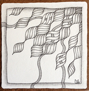
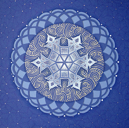
In November I was blessed to be asked to teach several classes to a wonderful group of Certified Zentangle Teachers at a retreat in Maine. Two of the classes were a series. In the first class I taught the Lace and Convergent Shading techniques. The second class was a project that was inspired by the tangled drawings I had seen posted that had been done on paper doillies. I had paper laser cut with a simplified lace design and used the Lace and Comvergent Shading techniques to create the following winter inspired design. I call it WinterLace.

The project uses metalic gold and clear stardust (sparkles) Gelly Roll pens which are difficult to photograph. However, this photo is a pretty good example of the finished product.

These two classes were very well received and as a result, in partnership with Acadia Laser Creations, I decided to make it into a kit.

The kit contains instructions for both classes (a 2-fer) and all the materials and supplies you need to create your own WinterLace project.

The Kit materials include a laser-cut pattern on dark blue paper, a light blue background sheet, a white mat with foam core backing and protective sleeve, 3 gel pens, 2 colored pencils, a royal blue Micron and 2 tortillons.

“But wait … there’s more!”

My fellow CZT, Jenny Perruzzi, suggested I should include a stencil that would allow you to draw the same lace shapes that are laser-cut in the kit. I rarely encourage the use of stencils in Zentagle as I feel they can too easily become a crutch and support that inner critic that says “I can’t draw” (therefore I need a stencil). Well she cut one for me anyway and I had a lot of fun with it. I realized that this project is actually considered Zentangle Inspired Art (ZIA) so playing is OK, and the stencil actually reinforces some of the concepts taught in the Lace technique.

So included in the kit is a 3-in-1 stencil to play with and create endless designs. There are 3 sizes on the stencil: Small (Zendala size), Medium (same size as project piece – a zendala tile fits in the center) and Large (Opus size). The overall stencil measures 10.5″x10.5″. See photo below.

Here are some sample pieces I created using the stencil.

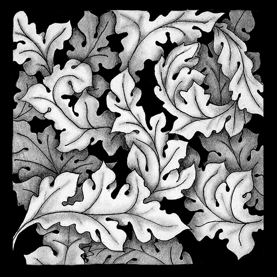
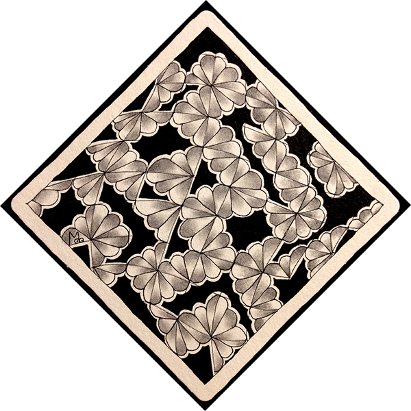
This piece was drawn on a 10.5 x 10.5 Opus tile and
uses the large size stencil.

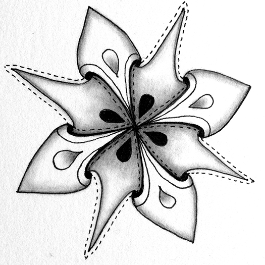
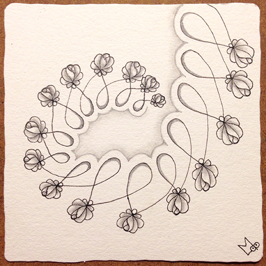
This piece was drawn on a 4-5/8″ Zendala size tile and
uses the small size stencil

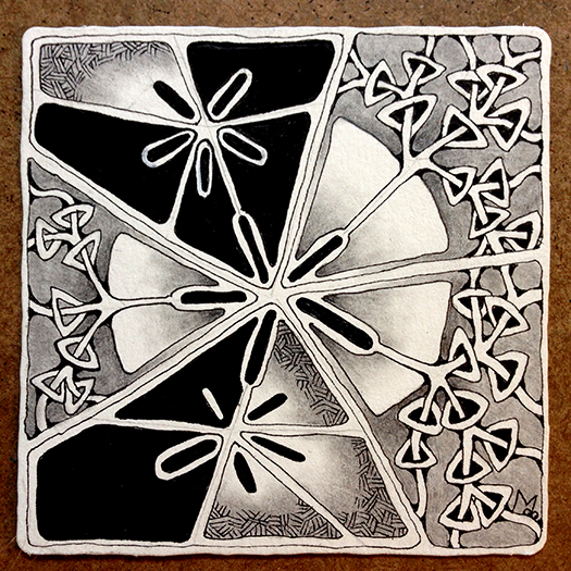
This piece was drawn on an 8″ square and
uses the medium size stencil.

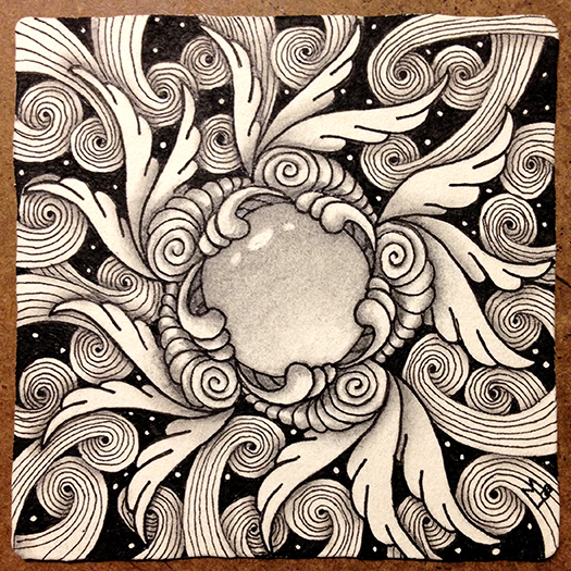
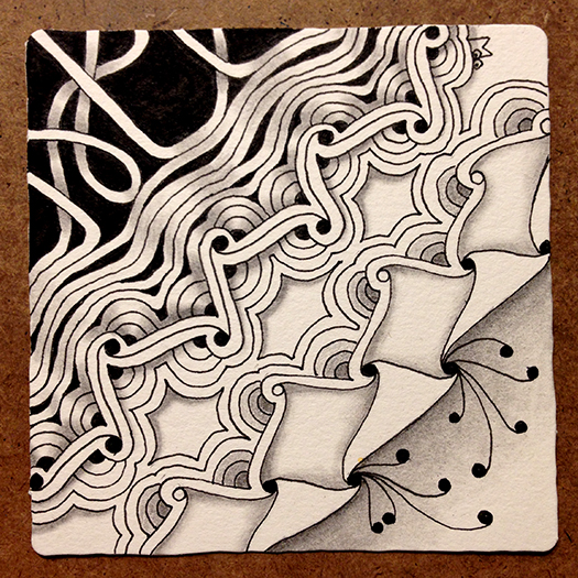
This example also uses the medium size stencil but
shows the use of a separate Zendala placed in the center.

So you can see, once you learn the techniques there is no end to what you can create.

Here’s what other Tanglers are saying about the kit…

“Lynn takes intimidation out of the drawing equation. What might appear to be a complex drawing becomes a simple step-by-step process with Lynn’s clear and easy instruction.”

“Lynn’s project is awesome! I was overwhelmed by the artistry of the finished product.”

“Lynn’s easy step-by-step instructions will put you right at ease and have you feeling like a pro in no time! Not to mention feeling like a creative genius with the beautiful end product you will create with this amazing kit!”

“Lynn’s unique perspective on the world translates into easy to follow design techniques so that anyone can create beautiful art work.”

The WinterLace kits are now available on Etsy for an introductory price of $65.00 through the Winter Solstice, Dec. 21.
https://www.etsy.com/…/498115…/the-tanglelace-winterlace-kit

I’m very excited to reach a larger audience with the classes contained in this kit.

Blessings,

Lynn

Tiny Tangle Deck is here!

We went BIG with the original Tangle Decks 1 & 2
Now we’re going TINY!!!

Introducing…Tiny Tangle Deck – On Sale Now


Tiny Tangle Deck may be only 2” x 2” but it’s big on content. It contains all 100 tangles from the original Tangle Decks 1 & 2 and it’s printed on the same durable coated card stock.

Each card contains:

  • the basic drawing of each tangle
  • the tangle name and creator
  • the elemental strokes used to draw the tangle

Each tangle card is color coded so you know which original deck to look in for the step-outs, red for Deck 1 and blue for Deck 2.

Even more portable than the original Tangle  Decks, it comes in its own metal tin.

On Sale Now for the introductory price of $16

or

Get the Tangle Deck Family (Tangle Deck 1, Tangle Deck 2, AND Tiny Tangle Deck) for $80

Click Here to Purchase

Moowa – Square One Focus

This week’s Square One focus Tangle is Moowa by CZT, Anya Ipsen. Step-outs can be found here.

While my tile this week does use Moowa (it is the tangle in the middle) this post is more about finishing a tile than about the tangle itself.

As you can see from the first photo I took, sometimes the tangle only drawing is just too busy. It really needs contrast and shading to differentiate the different tangles. From the center out I’ve used Moowa, Joki, Drawing, and Sandswirl.

moowa-1-150ppi

You can see how just adding the black background is starting to give shape to things.

moowa-2-150ppi

On this tile I worked from the background forward. Adding extra lines to the sand swirl darkened its tone a little and pushed it behind Drawings. I’ve also gone over Moowa and Drawings with a thicker pen.

moowa-3-150ppi

Adding shading further defines the tangles.

moowa-4-150ppi

And finally, I shaded the central section.

moowa-final-150ppi

I love how this came out. It reminds me of Madeline L’Engle’s book “A Wrinkle in Time”. The middle is like a window into another world.

As always, If you see anything in this post that you’d like to try in your own work, please feel free to do so.

Blessings,

Lynn

Rainking – Square One Focus

The square one focus for the week of Nov 11-17 is Rainking by Leona Shih. Stepouts can be found here.

Rainking can be considered a fragment tangle. Fragment tangles are the elements that fill the spaces of a grid. Fragments can be rotated or mirrored to create variations. Rainking reminded me of another tangle, Cornerz by Didier Gervy, that can be rotated and mirrored to create either a very ordered pattern or a more organic meandering pattern. Here’s an example of Cornerz. I drew the same fragment on 16 Biju tiles then laid them out in different ways, all the same orientation in one example and rotated randomly in the other example.

cornerz02

cornerz

For my Rainking tile I decided to create a more random meandering version.

First I drew a grid with wavy lines to show some movement, and started adding the Rainking fragment randomly.

rainking01-150ppi

Here it is with the Rainking covering the tile.

rainking02-150ppi

I then drew an aura around the spaces that formed between the Rainking fragments and began filling them in with black. I wanted to cover up some of the grid lines and make the fragments stand out more.

rainking03-150ppi

After I got the spaces between filled with black I wondered what it would look like if I shaded each “petal” of Rainking in the opposite direction of the one next to it. I started by adding graphite alternately to the top or bottom of each “petal”. ( I remembered to take photos of the shading in progress for this tile.)

rainking04-150ppi

Here is the tile before the final blending.

rainking05-150ppi

And here is the finished tile. After blending I went back in and added more shading to the darkest areas.

rainking07-150ppi

The final result reminds me of fallen petals after a spring bloom. This was an interesting experiment.

As always if you see something in this post that you’d like to try in your own work please feel free to do so.

Blessings,

Lynn

Florez – Square One Focus

This week’s (Sept 30 – Oct 6) Square One focus tangle is Florez introduced by Andrea Shuman, aka Cookie. This is a tangle I have not used before but is a close relative of N’Zeppel one of the tangles introduced by Zentangle HQ.

If you follow my blog you will know that I usually start out the Square One focus by just playing around with the tangle to get to know it better, especially if it’s one I’ve not drawn before. This has been a very hectic week so I thought I’d pick up a tile and just draw without intending it to be a Square One tile. Before I realized it I had drawn a Florez shape string so decided to go with it. Unfortunately I was swept up in the creation of this tile and did not take any work-in-progress pictures, but I can share a lot about this tile anyway.

florez-tile

First off I should reveal that it started in a completely different direction than what you see as the finished tile. I started drawing patterns in the shapes that are now black, then was inspired to draw the sections that contain Rixty. I loved where that took me but it didn’t really go with the sections I started with. Those sections had to go, so that is how they came to be black (my own take on the Bronx Cheer). This literally set the tone for the rest of the tile. From that point on, drawing and shading decisions were made in order to balance out these black spaces.

The second thing I wanted to point out was the use of Convergent Shading in this tile. I introduced this concept in Tangle Deck 2 but have not addressed it here in my blog. It is used in the sections containing Rixty. In convergent shading two adjacent shapes are shaded from dark to light in opposite directions. Here is an example using stripes so it is easier to see.

convergentshading

In this tile the area around Rixty is shaded dark to light toward the center while the pie shapes are shaded dark to light from the center out. Here is a detail showing what I mean. This helps to define edges in an interesting way.

florez-tile-detail

The third thing I wanted to share about this tile is the way the black shapes float on top. Usually darker shapes recede into the background. I did not do this intentionally, it just happened as a result of the way Rixty is drawn seemingly on top of the pie shapes pushing them to the back. Further supporting this illusion you can imagine that those pie shapes continue behind the two black sections to form a circle. As one person commented “It looks like the moon is hiding in the back!” Take another look at the tile and see if you can see what I mean.

florez-tile

This tile had secrets to reveal and I admit I was an accomplice.

As always, If you see something in this post you’d like to try in your own work, please do.

If you are on FaceBook and you’d like to try the Square One focus sometime, or just follow the page for inspiration you will find it here.

Blessings,

Lynn

CreZendo – Square One Focus

This weeks Square One focus tangle is CreZendo, by Pam Hartz Miller CZT. Step-outs can be found in the comments of this weeks Square One FaceBook post (found here).

CreZendo is one of those long and thin tangles that pose an interesting problem, one immediately thinks of using them as a border and it can be hard to think about them in other ways. I like to look for a less obvious solution and in the case of CreZendo it’s S-shape lines and Crescent Moon-ish shapes suggest to me several tangles that would complement it.

crezendo-01-150ppi

For my tile I decided to forgo the obvious Crescent Moon and instead do a little rounding which allowed me to flow right into Diva Dance and build on the auras of the tangle. On the opposite side I mirrored another line of CreZendo but only added the Crescent Moon-ish shapes to one side. This allowed me to flow right into Cadent.

crezendo-02-150ppi

Diva Dance turned into Hollibaugh and I added some black highlights and background. Cadent sprouted some Fescu which again uses the s-shape line.

crezendo-03-150ppi

Here’s how the final shaded tile came out. I think it flows together pretty well.

crezendo-04-150ppi

As always, if you see anything in this post you’d like to try in your own work, please feel free to do so.

Blessings,

Lynn

Introducing Abeko

I’ve taken a little vacation from posting for most of July but it’s now time to get back into the swing of things. I’m going to share my Square One tile for the week of July 22-28 and introduce you to a tangle called Abeko.

The Square One focus tangle was Echoism, one of the tangles introduced by Zentangle HQ. (Margaret Bremner has an excellent post on her blog called Echoism, and then some).  As usual I started out just playing with this tangle in my sketchbok. Here are a couple of ideas I tried.

Echoism-sketch-150ppi

I liked the way the loops on the left image snuggled up together with the adjacent rows so for my first tile I incorporated that. I added a twist by adding a border and then filling in some of the spaces with black.

Echoism1b-150ppi

I’ve also been playing with a tangle that came to me a while ago that is started by drawing either Eke or Echoism and then adding on to that. With Echoism as the focus that gave me the opportunity to play with this tangle as well. Here is my second tile which blends a version of this tangle with Echoism.

Echoism2-150ppi

I word about new tangles… I never feel like a tangle is something I created, never felt like it was mine. It’s more like the tangle comes to me and we partner so that it can be introduced to the world. I call this tangle Abeko, because to me it’s like a combination of Abundies and either Eke or Echoism. I think you can see what I mean in this series of step-outs…

Abeko-150ppi

Here are a couple more tiles using Abeko. This first one is kind of a mono tangle sampler.

Abeko Sampler 150ppi

This second tile uses the flower variation of Abeko in a cross shape with an aura around it. I really liked the way it turned out here.

Abeko-2-150ppi

UPDATE: Some people wanted to see in more detail how this was drawn so here is a short stepout:

crossed-Abeko

I know this tangle is similar to other tangles that are out there but I’ve not seen one exactly like this one that is based on Eke or Echoism. It’s what came to me so it’s what I’m passing along.

As always if you see anything in this post that you would like to use in your own work please feel free to do so.

Blessings,

Lynn

Groovy – Square One Focus

This week’s Square One: Purely Zentangle focus tangle is Groovy by Eden Hunt. Step Outs for this tangle can be found here.

I have a very busy summer ahead so I don’t know if I’ll be able to keep up with the weekly posts for the Square One focus. I’m already behind and I decided I wouldn’t try and catch up. But first off here are the two tiles I did for last week’s focus: Rundl by Ela Rieger.

In the first tile I added Diva Dance to Rundle and did the background using pencil.

Rundl-01

In the second tile I used rounding on the Rundl.

Rundl-02

Now to this weeks focus tangle. Groovy, uses a wavy grid, also known as an Ogee grid. It looks like this. (Note: I mentioned this grid in my last post too.)

ogee

To warm up for this week’s tile I decided to do a “sampler” tile with several tangles that use this grid. It turned into a kind of Family Portrait. Tangles used are top & bottom – Bask-it by Anna Houston, left to right – African Artist by Tina Hunziker, Scrumble by Jane Monk, and Groovy by Eden Hunt.

Groovy Family Portrait

After this fun warm up exercise I moved on to a mono tangle of Groovy. I started with the wavy grid but as you can see it did not want to stay together and instead pulled apart a bit at the edges.

Groovy-01-150ppi

Next came the diagonal lines that alternate back and forth. They didn’t want to cooperate either and one space got left blank.

Groovy-02-150ppi

Then anarchy ruled and some of the ribbons got loose and some of the shapes turned see through.

Groovy-03-150ppi

In the end I let Groovy have it’s way and I like what it did. What do you think?

Groovy-04-150ppi

As usual if you see anything in this post that you would like to try in your own work please feel free to do so.

Blessings,

Lynn