Printemps – Square One focus tangle

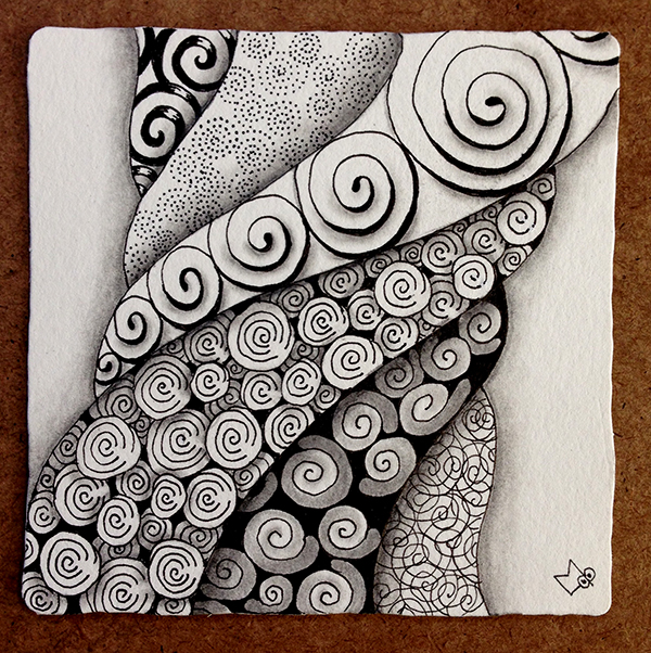
This weeks Square One focus tangle is Printemps. This is one of the tangles I use all the time so I did not feel the need to explore this tangle in my sketchbook this week.

I have been wanting to do a tile using Margaret Bremners “Rope String” idea though and thought this might be a good time to try that.

I started off with a Rope string and began filling it with different variations of Printemps.

Printemps-01-150ppi

Then I added some black background, line weighting, and sparkles to some of the variations. This added a little more contrast to the tile.

Printemps-02-150ppi

Finally I added the shading to finish the tile. I wanted the section with the large line weighted spirals to be in the forefront and then each section to be on top of the next moving toward the edges of the tile. Each section was shaded only along one edge to help create this illusion.

Printemps-03-150ppi

I like the way the Rope string provided discrete sections for the Printemps variations and also tied them all together (no pun intended or maybe it was).

As always if you see anything in this post that you would like to try in your own work please feel free to do so.

Blessings,

Lynn

C-Scape – Square One Focus

This weeks Square One focus tangle is C-Scape by Susan Rink Olsen CZT. The stepout for this tangle can be found here on tanglepatterns.com.

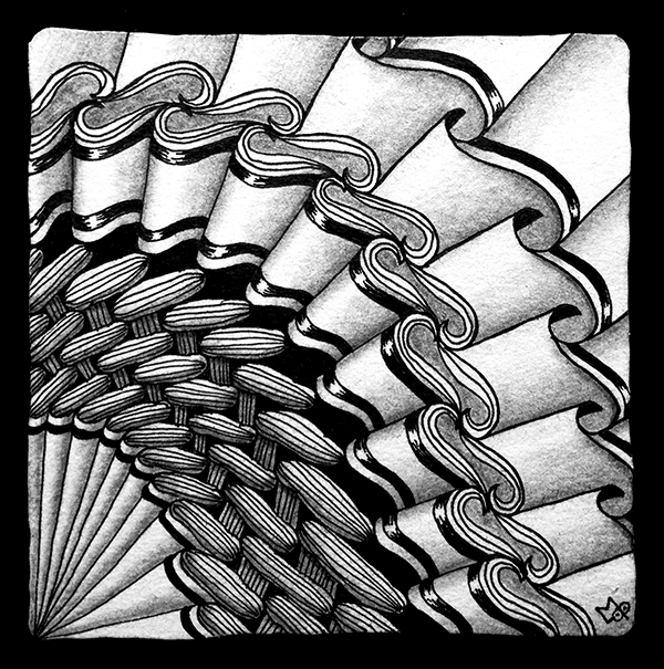
This is another tangle I’ve never tried so I did lots of playing with it to get familiar. One thing that struck me right away was that I thought there was a relationship between this tangle and Peanuckle so I knew I wanted to use them both in my tile. But first I had to learn C-Scape.

Sketch02-150ppi Sketch01-150ppiAs I began to get a feel for C-Scape I decided to start a tile. While C-Scape makes a great border I wanted to do something else. I settled for a curved stacked effect. I started with the C-Scape in the middle and worked out from it in both directions to the edges. As I worked I didn’t really know where this was going so I just kept adding one line at a time.

C-Scape-01-150ppi

When I finished the outlines I really didn’t know what to do next. I added a couple auras then certain shapes just seemed like they should be filled in black so I started there. Next I began filling in the Peanuckle sections with the traditional lines.

C-Scape-02-150ppi

This set the tone for the tile so I just continued adding black accents and auras.

C-Scape-03-150ppi

Finally came the shading that really made all the folds look 3-D and tied it all together. I like the way C-Scape and Peanuckle worked together and I like the way the two upper right sections blend together but seem to be going in different directions.

C-Scape-04-150ppi

Some tiles excite me from the beginning and I can’t wait to draw the next line. This tile wasn’t that way. I really had no moments of vision for this tile but I always work through and enjoy the process till the end. That’s when a tile’s spirit is truly revealed and this one now brings me joy.

As always, please feel free to try anything you see in this post in your own work.

Blessings

Lynn

Pepper – Square One Focus

This week kind of got away from me so I thought I’d better hurry up and write a post before the next Square One Focus Tangle was revealed.

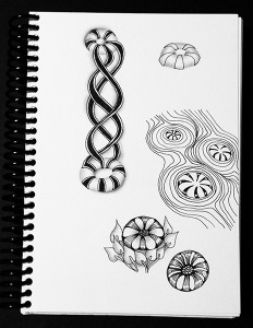
This weeks focus was Pepper. Honestly, Pepper has never really inspired me much so as usual I started by playing around with it in my sketch book.

Sketches150ppi

I had fun with extending the Pepper stripes into Quib and then back to Pepper again. Also liked the floating Pepper and the flower-like figure that emerged when I added some rounding.

What I ended up with when I started my tile was a combination of some of the features that presented themselves as I sketched.

Pepper-01-150ppi

The string was simple.

Pepper-02-150ppi

I added Pepper with tails fluttering behind and a variation of Rain bent around it.

Pepper-03-150ppi

I filled in the Pepper stripes and tails with a few sparkles added for interest and added some line weighting to the Rain lines for dramatic effect.

Pepper-04-150ppi

I added minimal shading to emphasize the Pepper shape and add a little more interest to the Rain. This is the final tile.

After I had posted this tile I found myself awake in the middle of the night, which doesn’t happen very often to me. I used this time to do another Pepper tile. I didn’t take W.I.P. photos but following is the finished tile. If you’d like to try these Dew Drops check out my tutorial.

Tile 2-150ppi

As always, if you see anything in this weeks post that inspires you, please feel free to play around with it in your own work.

Blessings,

Lynn

Pokeleaf – Square One focus

This week’s Square one focus is Pokeleaf. I haven’t used this tangle much recently, so I enjoyed playing with it a little in my sketchbook.

sketchbook01

First I played around with different ways to embellish the leaves.

Sketchbook-03-150ppisketchbook02

Then I thought “What if I drew Pokeleaf in a Mooka way?”. I liked the idea but the leaf shapes kind of got lost. I decided to add an inner aura to the leaves and make them “see-through” so I could see the leaf shape behind. I really liked this look and decided to use this on my Square One tile.

Pokeleaf 01-150dpi

I started with the Mooka’d Pokeleaf with the inner aura on each leaf so the leaves behind could be seen.

Pokeleaf 02-150ppi

I then added a little shading to the “stems” and where the leaves overlap.

Pokeleaf 03-150ppi

It seemed like the leaves needed some definition so I added shading that was darker at the tips and gradually gets lighter toward the stems. This is a bit of play with Positive and Negative shapes as I often like to do.

Pokeleaf 04-150ppi

Finally I added a little shading around the outside of the leaves just because it seemed like it needed it to pull it all together.

I like that it turned out simple yet complex looking at the same time.

UPDATE: Mooka’d see-through Pokeleaf #2

I did another tile using the Mooka’d see-through Pokeleaf as a string. Following are the work-in-progress photos.

image

Without shading the filled in string looks kind of flat and busy to me.

image

Adding shading creates emphasis and dimension. The shading is simply added around the edges and where forms overlap.

image

As with all the work I post, if you see something you like please feel free to experiment with it in your own work.

Blessings,

Lynn

Henna Drum – Square One Focus

This week the Square One: Purely Zentangle focus tangle is Henna Drum.  As stated on the Square One site, because so many in the Zentangle community are experiencing family medical crisis or the loss of a loved one, “this week’s ONE focus tangle [Henna Drum] is directed with care and compassion toward them.”

Henna Drum is a tangle that I have not used before, so I started as usual by drawing it in my sketchbook.

henna drum sketch1

henna drum sketch2

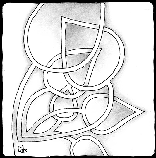
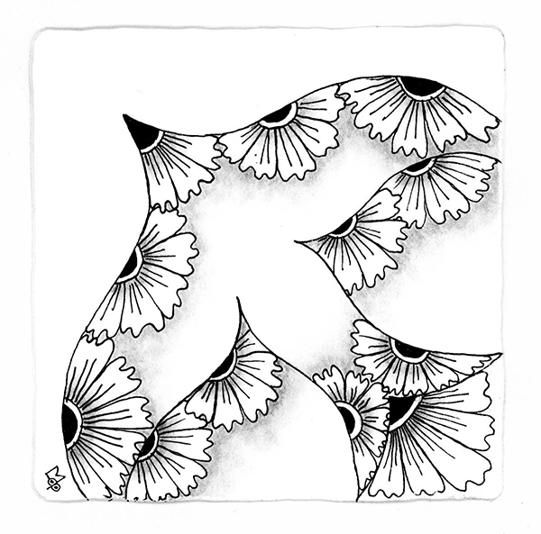
I wanted to do a tile that used a variation of Margaret Bremner’s “Flying Birds” string. I liked the bird shaped drawing from my sketchbook but not the Crescent Moon I used with Henna Drum (although I do like them together as they have some common elements).

I started my tile with a few “bird” strings.

henna drum 01-150ppi

Then I added the Henna Drum along the string edges. I used a simple version of the tangle without changes and embellishment. It felt feathery to me.

henna drum 02-150ppi

I thought about adding some tangles in the background but decided in the end to keep it simple and only added some pencil shading.

henna drum 03-150ppi

This is the result. Drawing this tile is my way of sending my love and support to all in the Zentangle community who may be in need of it at this time.

If you see anything in this post that you like, feel free to try it in your own artwork.

Lynn

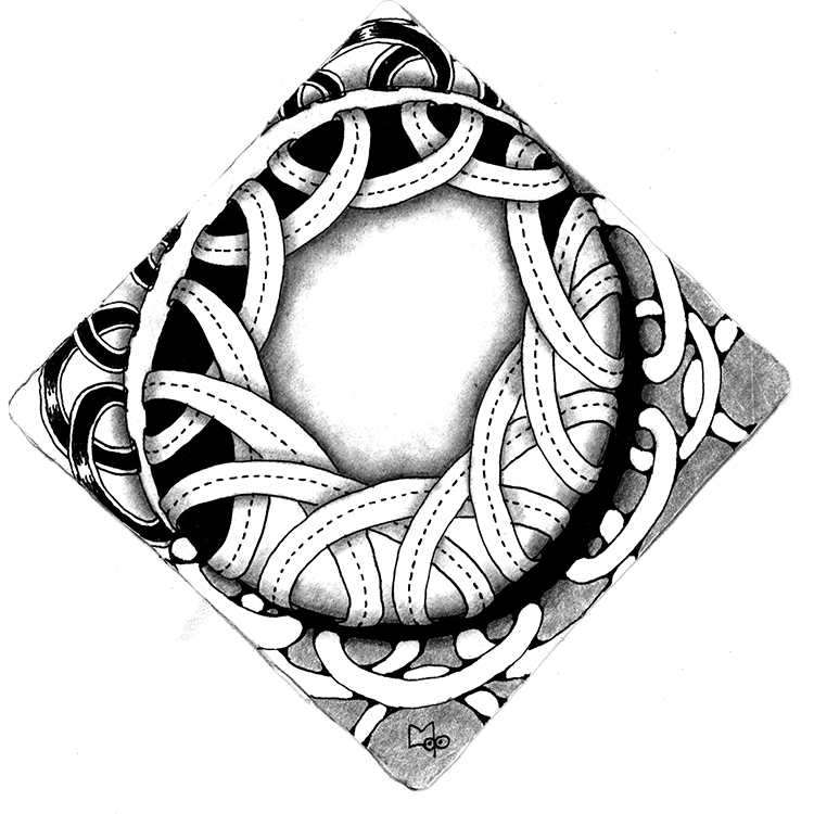
Umble – Square One Focus

This year I’ve decided to do a post each week on the tiles I do for the Square One: Purely Zentangle FaceBook page. If you are not familiar with the Square One page, each week they post a focus tangle which you are then supposed to use some way in a tile. The tiles must be 3.5″ x 3.5″ white tiles and you can only use black pen and graphite for shading.

Some weeks the focus tangle is one I know really well and sometimes it is one I have never used before. In any case I always start out by exploring the tangle in my sketch book so I get to know it a little better and/or feel more comfortable drawing it.

The focus tangle for this week is Umble, here is what I drew in my sketch book.

UmblePlay150ppi

There were a couple of effects I liked and wanted to incorporate into a tile. Following are Work In Progress photos and some explanation of my thought process along the way.

Umble-01-150ppi

I started with looping bands around a circular shape.

Umble-02-150ppi

The bands seemed plain so I added what I call Ant Trax down the middle. This adds a little interest and I think it helps emphasizes the over/under layering.

Umble-03-150ppi

I felt it needed some contrast so I started filling in the spaces between the loops with black. I got about half way around and then thought “If I continue to fill all the way around it will be too much black and not very interesting.” so I stopped.

Umble-04-150ppi

Then I had to balance out the light and dark so I added the black and white crescent shapes to either side. These help to define the edges of the circular shape.

Umble-05-150ppi

I played off the light and dark separation again when adding a couple more Umble variations to the outside area of the tile.

Umble-06-150ppi

This is the final tile with shading, which you can see does a lot to define overlaps, shapes and edges.

If you see an effect you like, please feel free to explore it in your own work.

Tangle On…Lynn