CreZendo – Square One Focus

This weeks Square One focus tangle is CreZendo, by Pam Hartz Miller CZT. Step-outs can be found in the comments of this weeks Square One FaceBook post (found here).

CreZendo is one of those long and thin tangles that pose an interesting problem, one immediately thinks of using them as a border and it can be hard to think about them in other ways. I like to look for a less obvious solution and in the case of CreZendo it’s S-shape lines and Crescent Moon-ish shapes suggest to me several tangles that would complement it.

crezendo-01-150ppi

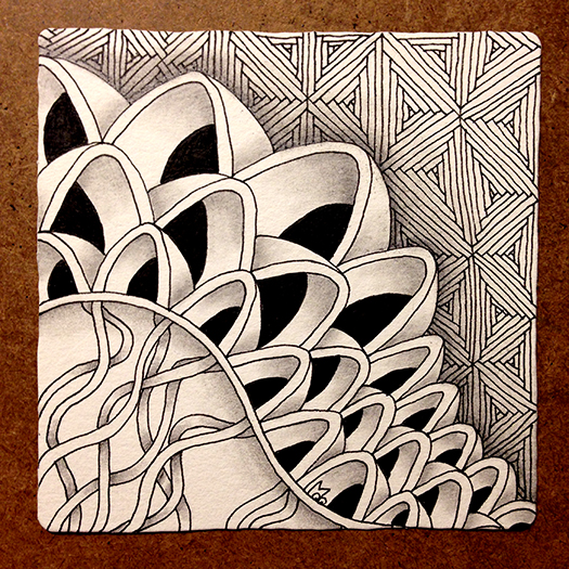
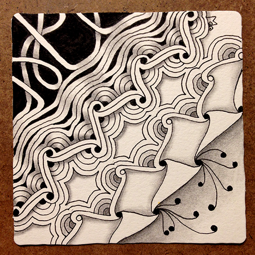
For my tile I decided to forgo the obvious Crescent Moon and instead do a little rounding which allowed me to flow right into Diva Dance and build on the auras of the tangle. On the opposite side I mirrored another line of CreZendo but only added the Crescent Moon-ish shapes to one side. This allowed me to flow right into Cadent.

crezendo-02-150ppi

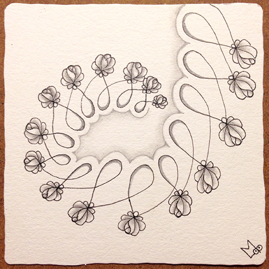
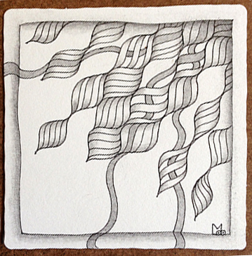
Diva Dance turned into Hollibaugh and I added some black highlights and background. Cadent sprouted some Fescu which again uses the s-shape line.

crezendo-03-150ppi

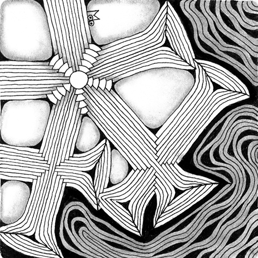
Here’s how the final shaded tile came out. I think it flows together pretty well.

crezendo-04-150ppi

As always, if you see anything in this post you’d like to try in your own work, please feel free to do so.

Blessings,

Lynn

Beeline – Square One Focus

The Square One focus tangle for the week of September 2-8 is Beeline, a tangle introduced by Zentangle HQ. Here are the step-outs for this tangle as illustrated on the card from Tangle Deck 1.

Beeline-Step-out

I knew as soon as I saw that the focus tangle was Beeline that I wanted to do a softer version replacing the black with gray. I have been playing around with Margaret Bremner’s Rope String recently and the thought occurred to me, what if I used it as the basic framework for Beeline? (I seem to ask myself a lot of What If? questions ; ). I remembered to take lots of work in progress pictures as I was drawing this week and I’m glad I did because the finished shaded tile looks so different from the beginnings that it really helps to see the tile develop. To get the softer feel I was going for, I used parallel lines to create the shades of gray. One advantage of this method was that the lines bisecting the diamonds just blended in with the rest of the lines and disappeared. Anyway here are the work in progress photos, they are self-explanatory.

Beeline-1-150ppi

Beeline-2-150ppi

Beeline-3-150ppi

Beeline-4-150ppi

Beeline-5-150ppi

Beeline-6-150ppi

This is the finished tile BEFORE SHADING…

Beeline-7-150ppi

…and this is the finished tile AFTER SHADING.

Beeline-8-150ppi

As usual if you see anything in this post that you would like to try in your own work, please feel free to do so.

Blessings,

Lynn

Viaduct – Square One Focus

This weeks Square One focus tangle is Viaduct by Wayne Harlow CZT. Stepouts can be found here. As usual I started out by trying different variations of the tangle in my sketchbook and in general just becoming friends with it. Here are some of my sketches.

Viaduct Sketches-150

I liked the idea of seeing through the arches AND they just seemed to want to go in different directions.

V-tile02-150

V-tile01-150

I kind of felt like I was drawing a cartoon this week, I guess because this tends to be a bold tangle and the arches wanted to be wobbly. In the end I embraced it and just started a tile.

This was my journey…

File03-a150

File03-b150

File03-c150

File03-d150

File03-e150

Note: Sometimes when I’m stuck about what to add next I shade what I have already drawn. You don’t have to wait till the end to shade the whole tile.

Here’s what I finally ended up with. I like the wonky Viaduct, I like the contrast of the fine lines of the Fassettoo background to the simple bold shapes of Viaduct, and I like the way the faces of the arches turned into Quib-like ribbons at the bottom.

File03-150

As usual if you see anything in this post you’d like to try in your own work, please feel free to do so.

Blessings,

Lynn
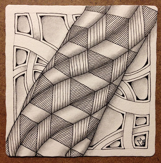
Introducing Abeko

I’ve taken a little vacation from posting for most of July but it’s now time to get back into the swing of things. I’m going to share my Square One tile for the week of July 22-28 and introduce you to a tangle called Abeko.

The Square One focus tangle was Echoism, one of the tangles introduced by Zentangle HQ. (Margaret Bremner has an excellent post on her blog called Echoism, and then some).  As usual I started out just playing with this tangle in my sketchbok. Here are a couple of ideas I tried.

Echoism-sketch-150ppi

I liked the way the loops on the left image snuggled up together with the adjacent rows so for my first tile I incorporated that. I added a twist by adding a border and then filling in some of the spaces with black.

Echoism1b-150ppi

I’ve also been playing with a tangle that came to me a while ago that is started by drawing either Eke or Echoism and then adding on to that. With Echoism as the focus that gave me the opportunity to play with this tangle as well. Here is my second tile which blends a version of this tangle with Echoism.

Echoism2-150ppi

I word about new tangles… I never feel like a tangle is something I created, never felt like it was mine. It’s more like the tangle comes to me and we partner so that it can be introduced to the world. I call this tangle Abeko, because to me it’s like a combination of Abundies and either Eke or Echoism. I think you can see what I mean in this series of step-outs…

Abeko-150ppi

Here are a couple more tiles using Abeko. This first one is kind of a mono tangle sampler.

Abeko Sampler 150ppi

This second tile uses the flower variation of Abeko in a cross shape with an aura around it. I really liked the way it turned out here.

Abeko-2-150ppi

UPDATE: Some people wanted to see in more detail how this was drawn so here is a short stepout:

crossed-Abeko

I know this tangle is similar to other tangles that are out there but I’ve not seen one exactly like this one that is based on Eke or Echoism. It’s what came to me so it’s what I’m passing along.

As always if you see anything in this post that you would like to use in your own work please feel free to do so.

Blessings,

Lynn

Groovy – Square One Focus

This week’s Square One: Purely Zentangle focus tangle is Groovy by Eden Hunt. Step Outs for this tangle can be found here.

I have a very busy summer ahead so I don’t know if I’ll be able to keep up with the weekly posts for the Square One focus. I’m already behind and I decided I wouldn’t try and catch up. But first off here are the two tiles I did for last week’s focus: Rundl by Ela Rieger.

In the first tile I added Diva Dance to Rundle and did the background using pencil.

Rundl-01

In the second tile I used rounding on the Rundl.

Rundl-02

Now to this weeks focus tangle. Groovy, uses a wavy grid, also known as an Ogee grid. It looks like this. (Note: I mentioned this grid in my last post too.)

ogee

To warm up for this week’s tile I decided to do a “sampler” tile with several tangles that use this grid. It turned into a kind of Family Portrait. Tangles used are top & bottom – Bask-it by Anna Houston, left to right – African Artist by Tina Hunziker, Scrumble by Jane Monk, and Groovy by Eden Hunt.

Groovy Family Portrait

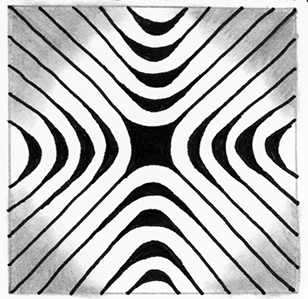
After this fun warm up exercise I moved on to a mono tangle of Groovy. I started with the wavy grid but as you can see it did not want to stay together and instead pulled apart a bit at the edges.

Groovy-01-150ppi

Next came the diagonal lines that alternate back and forth. They didn’t want to cooperate either and one space got left blank.

Groovy-02-150ppi

Then anarchy ruled and some of the ribbons got loose and some of the shapes turned see through.

Groovy-03-150ppi

In the end I let Groovy have it’s way and I like what it did. What do you think?

Groovy-04-150ppi

As usual if you see anything in this post that you would like to try in your own work please feel free to do so.

Blessings,

Lynn

C-Wing – Square One Focus

This past week the Square One focus tangle was C-wing by Staub Korn.  It is one I had never tried before so I practiced it a bit in my sketchbook in order to get to know it a little better. I noticed a couple of interesting things about this pattern. First, there is an Ogee grid hidden in the pattern (I’ve gone over it in red in the photo below) and Second, it can be broken down into a Fragment which when mirrored and rotated forms the tangle ( I’ve also indicated the fragment in red).

C-wingSketchIdeas-150ppi

If you are unfamiliar with Fragments, they are a concept that Rick and Maria have introduced in their recent book Zentangle Primer Vol. 1. Fragments are elements that when placed in a grid create a pattern. Note: R&M refer to the grids used with fragments as Reticula. Different patterns can be created by repeating, rotating or mirroring a fragment. But more about that in a later post.

For this week’s tile I started with a dot grid since I didn’t want the lines from a lined grid to show. I chose to use a variation of the tangle that offset the overlapping shapes in alternating rows.

cwing-1-150ppi

I did the main outline with a .05 Apprentice pen. Then I drew an inner aura in each shape with a .01 micron. Some shapes I made see-thru so the shapes behind could be seen. Then I added tone and texture through line and fill.

cwing-2-150ppi

The shading enhanced the effect of the solid and see-thru, the foreground and background. Here’s the final tile.

cwing-3-150 ppi

What I like about this tile is that the tangle is very regular but the fill is unexpected.

As always if you see something in this post that you’d like to try in your own work, please feel free to do so.

Blessings,

Lynn

IX and Bales – Square One Focus

I was away from my computer last week so did not get a chance to post my Square One tiles, so I’m combining last week with this week. Last weeks focus was IX, a tangle introoduced by Zentangle HQ.

I see lots of possible combinations of tangles that work well with IX so I did two tiles using several of the options. Instead of showing work-in-progress photos I decided to show why I choose the tangles I did for each of the tiles.

Here is the first tile…

IX-tile-01-150ppi

I used IX, plus my tangles Fassett and Fassettoo. Here is a diagram I drew in my sketchbook outlining the common elements of the three tangles.

IX-01-150ppi

These common elements give the tile a unified look and help the tangles seamlessly morph from one to another.

In the second tile I used IX, Arukas, and Diva Dance and I added some rounding.

IX-tile-02-150ppi

Here is the diagram I made depicting the common elements of Arukas, IX and Diva Dance.

IX-02-150ppi

Again the common elements between the tangles unify the tile and the rounding helps with this. Arukas terminates into IX on several of it’s arms creating a Tango of the two. And while Diva Dance has the shared elements of lines and black spaces it’s curvy-ness provides some contrast to the straight lines of IX and Arukas. I also shaded it grey to add to the contrast.

This weeks Square One focus tangle is Bales, and I decided to do something simple. Got to give my mind a break sometimes. I draped the grid for bales over the border on my tile to give it a little interest.

BalesTile-150ppi

As usual if you see anything in this post that you’d like to try in your own work please feel free to do so.

Blessings,

Lynn

Fugu – Square One Focus

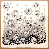
After a brief hiatus to finish Tangle Deck 2, teach at Tangle U and then recover from both those things I’m back to posting my Square One tiles. This week’s focus tangle is FUGU by Sonya Yencer.

Frankly I feel kind of burnt out from the final push to get Tangle Deck 2 finished so I just played with FUGU a little in my sketchbook.

Fugu Sketches-150ppi

FUGU just seemed to want to have fun so I went with that for the tile.

I started by adding the “football” shapes with auras and then added the orbs and embellishments.

Fugu01-150ppi

Fugu02-150ppi

Next I started at the bottom of the tile and began to add some contrast using black pen.

Fugu03-150ppi

Fugu04-150ppi

I finished the tile with pencil shading to add a grey mid-tone and some detail.

Fugu05-150ppi

This tile turned out whimsical and very comic-like to me and for some reason reminds me of Where’s Waldo. I guess that’s what I needed in my life this week.

As always, feel free to use or share anything you see in this post.

Blessings,

Lynn

Zonked – Square One Focus

This past week’s Square One focus tangle is Zonked by Barbara Finwall. Step Outs can be found here.

As soon as I saw that the focus tangle was Zonked I knew that I wanted to morph it into another Tangle. I didn’t even practice it in my sketch book and I was so absorbed in drawing the tile that I forgot to take work in progress photos. Not to worry though as I have a breakdown of the tangles I used and I’ll explain why I chose these particular tangle to use in the morph.

I started with the curved version of Zonked.

Zonked 01-150 ppi

Then for something a little different I used the straight version of Zonked with a little twist. I drew the lines close together on one side and far apart on the other giving the tangle an off-centered look.

Zonked 02-150ppi

This in turn reminded me of Maryhill so that came next. To blend the two tangles I added a little rounding to Maryhill.

Zonked 03-150ppi

Finally I ended with Fassettoo because I wanted a tangle that was quite different from Zonked as the last Tangle. Again I added a little rounding to Fassettoo to create a connection to the rest of the tile.

Zonked 04-150ppi

All these tangles are drawn in triangles, consist mainly of lines and relate to each other when you add rounding to all of them. Here is my final tile.

Zonked Tile-150ppi

As always if you see something in this post that you would like to explore in you own work, please feel free to do so.

Blessings,

Lynn


Heartswell – Square One Focus

This week the focus tangle for Square One was chosen specially for Valentines Day. The focus tangle is called Heartswell by Helen Williams. Steps -Outs can be found here on her blog.
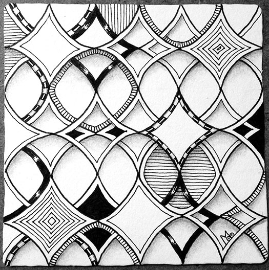
I really enjoyed learning and playing with this tangle. On the top of this page I explored drawing it in a Hollibaugh way. At the bottom I drew it on a Rope string like I used last week. This sure gave different results and it helped me understand why Helen said not to have your initial lines too close together. I also tried out several variations.

sketchbook-150ppi

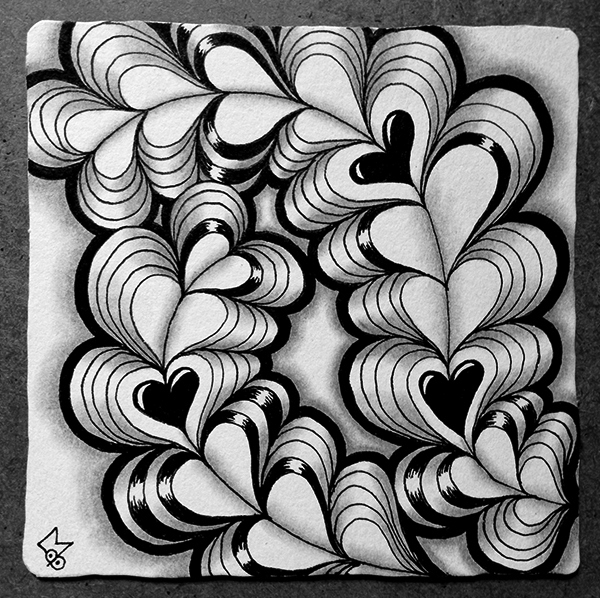
In the end I decided to go fairly simple for my tile since this can be a very busy tangle. I started with just two curving lines.

Heartswell-01-150ppi

Heartswell is fairly easy to draw and I just continued adding “swells” until they began to run together and off the edges. Then I added an Aura around the entire tangle. I liked the black aura I tried in my sketchbook so I filled it in with black.

Heartswell-03-150ppiI added three hearts as focal points and broke up the rest of the hearts with a couple of variations that were repeated several times randomly. This gave a little contrast but kept it simple.

Heartswell-04-150ppi

Finally, I added shading to add dimension and complete the tile.

Heartswell-06-150ppi

Happy Valentine’s Day

As always if you see anything in this post that you would like to try in your own work please feel free to do so.

Blessings,

Lynn